
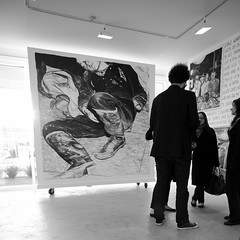
Above: Rinus Van de Velde, candid.
Rinus Van de Velde draws. And where Pettibon is often found dripping in his wet work, Van de Velde's charcoal and papers are dry. So, it seems at first easy to nod in agreement with Rinus' self-assessment. But, Pettibon is (usually) remarkable in his use of line, while in contrast Van de Velde produces value studies almost exclusively through skillful shading and blending. The former artist is actually the more "graphic" of the two.
Van de Velde, if not a painter, is deeply connected to the illusion of volume at which painters once aimed; especially noteworthy is the concomitant use of chiaroscuro. Yet again, though he begins with two-dimensional (digital) source material, Van de Velde is manifestly preoccupied with the rendition of a three-dimensional presence in a two-dimensional space. Towards that end, like a "real" painter, Van de Velde relies upon gradients and not linear work, e.g., cross-hatching or outlining, in order to suggest a given form. It's easy to believe that he began his training as a sculptor.

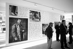
All of this omits the text. Rinus is given pause when asked about Barbara Kruger and Jenny Holzer. "I'll need to think about that," he responds. Kruger in particular seems good to mention as she furiously packs (virtually) all of the space between her images with text; like Van de Velde, both women (Kruger and Holzer) "write" directly upon architectural surfaces.
Returning to the beginning, it's the indication of the artist's own hand which not only draws Van de Velde close to Pettibon but which also distances him from Kruger's bold italic, and Holzer's electric, font. There's his hatching: in the writing. Different than any of them, Van de Velde's textual "ground" manifests as a fantastic sort of "stream of consciousness" monologue which, maybe akin to Joyce's "commodius vicus of recirculation," really goes nowhere.
Whether there is (ever) a progression towards meaning, this artist's "found" JPEG reinterpretations are buoyed along in a manner which is pleasing to behold...
Rinus Van de Velde in:
Dear David Johnson,
April 2 – May 14, 2011
moniquemeloche
2154 W. Division
Chicago IL 60622
http://moniquemeloche.com
- Paul Germanos
No comments:
Post a Comment