Wednesday, December 22, 2010

Review: Molly Zuckerman-Hartung @ Julius Caesar

Molly Zuckerman-Hartung lifted a small format (APS-C) DSLR to her eye and slowly turned round her studio space; at fairly regular intervals she depressed the camera's shutter-release button. Then, without post-processing, Zuckerman-Hartung employed a consumer-grade lab to print her documentary photography. Finally, overlapping one of the little (A6) pictures upon another she assembled five different projections: working as a geographer to map the spatial distribution of phenomena within her environment.

Molly Zuckerman-Hartung @ Julius Caesar

"Scrying," meaning an effort to gain knowledge through object-assisted visualization, is the title she's chosen for her show. Here, in lieu of a crystal ball, Zuckerman-Hartung has found the glass of an optical viewfinder, and lens elements, through which to gaze. And, mounted upon the gallery walls, a record of her objective, albeit Cyclopean, "vision" is available for public consumption.

In contrast, a low platform in the center of the space contains a collection of what the artist refers to as "scries." Said objects are small-diameter metal and plastic lids, each containing a little nonobjective abstract painting. These peculiar products look like the work of Zuckerman-Hartung's hand; they offer no explanation for their being, other than their maker. Whatever it is that Zuckerman-Hartung, or any other observer, "sees" in the scries is subjective.

Molly Zuckerman-Hartung @ Julius Caesar

While linked by a circular framing device (lens/lid) and a rectangular presentation (print/platform) the whole is otherwise characterized by a rough juxtaposition of the literal to the fantastic. And, the strongest connection between (a) and (b) is cleverly conceptual: it's usually from brief glimpses only, each colored by our imperfections, that we're able to cobble together some framework of understanding...

Molly Zuckerman-Hartung
"Scrying"
November 7 - 28, 2010
Julius Caesar Gallery
3311 W. Carroll
Chicago, IL
http://juliuscaesarchicago.com

Molly Zuckerman-Hartung,
http://www.mollyzuckermanhartung.com

Jason Foumberg's November 2010 review in NewCity,
http://art.newcity.com/2010/11/29/eye-exam-thing-and-its-other/

Alicia Eler's April 2008 review in Time Out Chicago,
http://chicago.timeout.com/articles/art-design/28304/molly-zuckerman-hartung

MW Capacity's December 2010 blurb and comments,
http://mwcapacity.wordpress.com/2010/12/29/molly-zuckerman-hartung/

- Paul Germanos

Thursday, December 16, 2010

Review: Peter Otto @ Devening Projects

Peter Otto's putrid palette befits his ghoulish subjects: he is a painter of the dead and the dying. Even so, "gore" per se isn't wholly descriptive Otto's preoccupation. In formal contrast to the documentation produced by photojournalists working in the theater of war, Otto consciously employs "painterly" abstraction. Through said means he's able to communicate in a nuanced manner, preventing both immediate fixation by horrific details and also too quick an interpretation thereof.

Artist Peter Otto @ Devening Projects

It's only slowly, while carefully examining the whole of Otto's most recent show, "The Lodger," that one is moved to consider what relationship might exist between a human skin stretched taut to form a lampshade and the fabric of a tent set in the desert. What does one membrane have to do with the other? Why establish such a parallel? Well, "cruelty and suffering," as enduring features of the human condition, might be one short answer. A better and longer exegesis would entail some discussion of the propensity of men to cause harm under cover of the name of that which they call "good."

Peter Otto @ Devening Projects

Moving masses of people to believe that they've freely chosen to participate in national and international conflict usually depends upon the promulgation of some ideology. Being non-corporeal, that ideology must (where visual artists eschew the use of text) symbolically "incarnate" prior to being available to spectators. Emptied of their humanity, Otto’s lifeless subjects are placeholders for the bad ideas which led to their demise.

Peter Otto @ Devening Projects

Metaphorically, "headhunting" is suggested by Otto to be the practice of savage warriors and effete politicians alike. For if some men do derive erotic gratification from the suffering of their fellows (we hope that) most do not. Most men need to be led to believe in the "rightness" of the cause for which they leave all that they love--only to fight and die in alien lands.

The (cyclical) tragedy depicted by Otto reaches back to the foundational works (if not also the symbols) of the Western canon, e.g., Thucydides' History of the Peloponnesian War. Seafaring, cosmopolitan, and commercial, Otto's own kinsman from the Netherlands might not be so distant from those Athenians of yore.

Artist Peter Otto @ Devening Projects

Whether particular knowledge of art and history is prerequisite to access the deeper levels of meaning available in Otto's paintings, the selection of works at Devening Projects is focused upon the time and space extending from Europe in the 1930s and 1940s to the present-day Middle East. Found most bluntly in the title, "Hand of History (Ode to John Heartfield)", is Otto's acknowledgment of Modern art historical precedent. Yet more incisive than said textual citation of Heartfield's name is the visual reference from the same piece, wherein Otto seems to wholly appropriate the central motif of Heartfield's 1934 montage, "O Christmas Tree in German Soil, How Crooked Are Your Branches."

Peter Otto @ Devening Projects

In Heartfield/Herzfeld's oeuvre, symbols with otherwise positive connotations were as a matter of routine co-opted and re-made into Nazi emblems; Heartfield's "Christmas Tree" suffered a deformation of its limbs, producing a swastika. Otto appears to lift that tree-become-swastika, that equilateral cross with arms bent at right angles, only to set it once again in a human arm bent at a right angle. As goes the tree, so goes the man.

Neo-expressionist brushwork and color keep these paintings distant from Herzfeld's photomontage. But, the paintings hang tightly together in what's a remarkably cohesive presentation. In toto, it looks like a display of mature style--something which is now found only rarely outside of local museums. And it's a pleasure to encounter that maturity not only on the canvas but also in the artist himself. What hope Otto has to offer is found only there, outside and above the spaces depicted, in his own real, creative act.  His verdict upon large-scale political solutions can be identified in the form of flags, not so much folded as deposited--coiled in snake or feces-like piles--upon the coffins of vainglorious corpses...

Peter Otto @ Devening Projects

Peter Otto
"The Lodger"
March 7 - April 9, 2010
Devening Projects + Editions,
3039 West Carroll Avenue
Chicago, IL 60612
(312) 420-4720
http://deveningprojects.com

Support: Cultural Services in the USA / Consulate General of the Netherlands and Materiaalfonds, Amsterdam.

First draft, April 5, 2010, in Newcity,
http://art.newcity.com/2010/04/05/review-peter-ottodan-devening-projects-editions/

Images posted, with comments, March 8, 2010, at Sharkforum,
http://www.sharkforum.org/2010/03/peter-otto-devening-projects.html

Feed taken, March 8, 2010, ArtSlant New York,
http://www.artslant.com/ny/feeds/show/61816

Second draft, December 16, 2010, at this location.

See also: Peter Otto interviewed in Bad at Sports Episode 240,
http://badatsports.com/2010/episode-240-peter-otto/

- Paul Germanos

Wednesday, November 3, 2010

Review: Rebecca Warren @ The Renaissance Society

It might be helpful to begin by remembering "L.H.O.O.Q." from 1919, wherein Marcel Duchamp seized a contemporary postcard print of Leonardo da Vinci's 1505 "Mona Lisa," defaced it with a moustache and tiny beard, and situated the titular acronym below the subject's thus modified countenance.

Especially noteworthy in the context of this review is that Duchamp (often) found it expedient to employ a "readymade" artwork, i.e., an object pre-existing for some distinct purpose, subsequently appropriated by the artist, and reintroduced as a beast of burden for his own ideology.  Acknowledging his 1917 "Fountain" as the more common point of reference in such discussions, "L.H.O.O.Q." seems like the best precedent in this case, inasmuch as it involves a gender-conscious mockery of the viewer's attachment to the likeness of one traditional expression of the idea of the beautiful.

Said to have been born out of the perceived failure of European values evident after the tragedy of World War One, the echo of the strategic concern which informed Duchamp's activity (Dada largely) has persisted now for nearly a century.  And, tactical distinctions notwithstanding, nothing other than direct observation of the phenomena surrounding the 
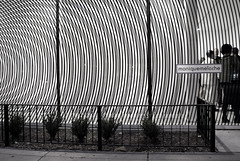
Rebecca Warren exhibition, which opened at the University of Chicago's Renaissance Society on the third day of October, 2010, is needed to confirm that assertion.

Rebecca Warren @ The Renaissance Society

Whether Warren's intent is actually self-evident, the Society's own Hamza Walker published the following teaching within his companion essay: "Her work is marked," Walker offers on her behalf, "by the appropriation (a polite way of saying chewing up and spitting out) of a squarely object-based tradition."[1] The text bounded by parentheses belongs to Walker; the quote is verbatim.  Where that "object-based tradition" is abstract, Walker supposes that it has served "as a means of silencing culturally specific voices, including those of women."[2]  And, looking at the historical representation of the human figure Walker perceives "a tradition in wholesale need of a woman’s deconstructive touch."[3]  What ought one to make of Walker's handling of art history and Warren's relationship to it?

Looking around, Warren's past treatment by Tate does seem to corroborate Walker's exegesis, stating that she: "intentionally misappropriates existing images by the accepted masters of figurative sculpture,"[4] and, "explores the degradation of established form."[5]

Too, in a description of Warren's concurrent display upon their own Bluhm Family Terrace, the Art Institute of Chicago provides that: "She knowingly references the work of canonical male artists,"[6] while laboring to "disrupt entrenched notions of the classical ideal."[7]   In fact, the very presence of Warren's sculptures upon said Terrace is given a gendered reading as they (Warren's sculptures) are called: "forceful counterpoints to Chicago’s renowned modernist skyline--itself dominated by works of the city’s greatest, mostly male architectural masters."[8]

Rebecca Warren @ The Renaissance Society

If one accepts--provisionally--what has been said to be the stance of the artist, it's good to continue the critical inquiry with a turn towards the formal qualities of the work.  Frustratingly, some of the pieces are nearly formless.  And it's difficult by means of any artwork to identify precisely which "canonical male artist" are her targets.  Curious as well, given its repeated invocation by her interpreters, is that Warren's own gender isn't evident through an examination of the sculpture which is on display.  In fact, the specific intent attributed to Warren (above) seems to be largely external to the visual experience of the exhibition within the gallery space.  That being the case, one is made to wonder from what source/s the unanimous declaration of Warren's purpose has been derived.[9]

It's rather difficult to find (on-line) a clear statement of Rebecca Warren's philosophy of art--made by Rebecca Warren.  Those statements which are available, and attributed to her, deal much more directly with the physical properties of the objects which she produces than with political conflicts between genders, or races, or classes.  And where cleavages such as gender are invoked, she would (if reported correctly) seem to imply that said constructs are mutable (permeable, even) rather than fixed: "The various materials start off contrasting along gender lines––in their qualities of durability, brittleness, rectilinearity, and crumbliness.  But these qualities are never stable for long, and they start to invade one another in ways that I find interesting."[10]

Not everyone shares Warren's interest.  One local Arts Editor, Jason Foumberg of Newcity, quickly made clear that he had grave reservations about the aesthetic nature of Warren's output.  In his review Foumberg posited that: "The unquestioning acceptance of any old piece of shit--here, Warren’s--by The Renaissance Society, which now only produces four exhibitions per year, is a waste of the institution’s good name and resources."[11]  The boldness of Foumberg's insight is laudable.  Though, suggesting that Warren's exhibition is "a waste of the institution’s good name and resources," he seems to presuppose that Walker and the other members of the Society's staff failed to produce the outcome which they desired.  Were it true, that would be odd.  Everyone involved (at the Society) must have known aforehand that Warren's art was not per se beautiful or novel; yet, they went forward with the program.  Why?

Rebecca Warren @ The Renaissance Society

By happy coincidence, the contemporary episode of the Chicago-based, arts-focused podcast Bad at Sports features an audio file containing an interview of School of the Art Institute Professor James Elkins by co-host Duncan MacKenzie.  Therein, early in the exchange, Elkins makes reference to "the deepest division" within the arts academy being between those parties whose "ultimate aim is to produce an object," and those parties wishing to practice what "ultimately you might call politics."[12]  With regard to the present undertaking, Elkins' pronouncement is timely and helpful.  Though (as Elkins seems to acknowledge) the application of a strict dichotomy would prove false, his (Elkins') description of the factions (beautiful object producers v. anti-aesthetic political actors) locked in an unresolved conflict probably hints at the truth of the situation.

Tension has been building, notably since the 1960's, as artists, and ever more often curators, have employed the tactic of introducing garbage (sometimes literally) into gallery and museum spaces for the purpose of: (a) contesting the commodity value of art within the economic system of Capitalism; (b) blurring the distinction between the high and the low, the beautiful and the ugly, and so forth; (c) incrementally breaking traditional attachments (to property, family, religion, nation, etc.) in anticipation of the opportunity to introduce new orders.

Rebecca Warren @ The Renaissance Society

For example, Italian Arte Povera might be described as a coming together of Dada's nonsensical, anti-establishment antics and a left-wing agenda for social change; in 1967 Germano Celant did refer to Marcel Duchamp by name in what's come to be called the Arte Povera manifesto.[13]  Closer to home, one might also consider the tone of the activity even now ongoing within many of Chicago's apartment and not-for-profit galleries.  While treating Lynne Warren and Mary Jane Jacobs' 1984 text "Alternative Spaces in Chicago," another Newcity Arts contributor, Dan Gunn, traced the evolution of those venues with roots in the 1970's which, he wrote: "grew out of a desire to show anti-commercial, ephemeral, or Feminist work."[14]

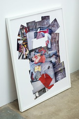
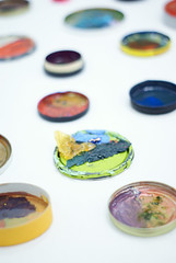
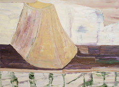
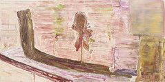
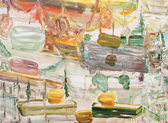
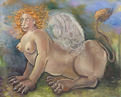
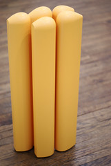
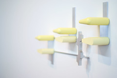
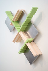
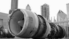
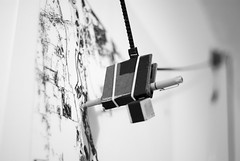
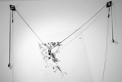
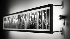
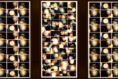
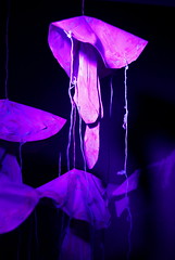
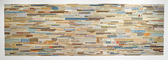
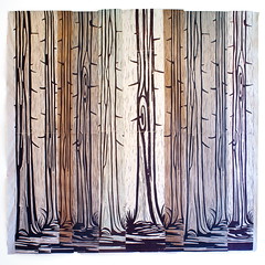
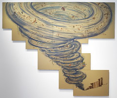
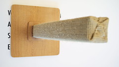
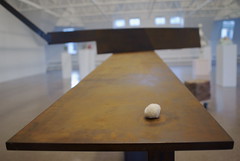
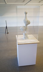
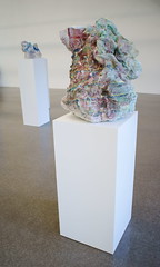
Ultimately, those three themes "anti-commercial, ephemeral, [...] Feminist" are more clearly evident in the curatorial choices and critical texts which involve Rebecca Warren than they are within the works involved in her exhibition.  It seems ridiculous to accept that Warren has set herself against the Western tradition of making art objects--by making art objects in the West.  The four distinct types of sculpture on display within the Ren's undivided chamber: (1) female figure; (2) abstract steel; (3) bronze cube; and (4) amorphous clay, function as parody only to the degree that the audience recognizes in their form the target of the parody, i.e., sculpture.  In truth, she's engaged in a very conventional--one might even say conservative--enterprise.  She produces sometimes delicate, sometimes costly, things which are shipped around the world for display in prestigious institutions.  Her work is in important collections; she's won awards and critical acclaim.  As ugly and imperfect as it might at times be, the "art world" is "working" for her.  In the end, it's not in her self-interest to truly injure the system; it's only useful to tickle it.

[1] http://www.renaissancesociety.org/site/Exhibitions/Essay.Rebecca-Warren.616.html
[2] Ibid.
[3] Ibid.

[4] http://www.tate.org.uk/britain/turnerprize/2006/rebeccawarren.htm
[5] Ibid.

[6] http://www.artic.edu/aic/exhibitions/exhibition/Warren
[7] Ibid.
[8] Ibid.

[9] http://www.guardian.co.uk/artanddesign/2009/mar/22/rebecca-warren-serpentine-gallery-review
Above: Laura Cumming for a more formal and less gendered reading of Warren's work.

[10] http://artforum.com/words/id=26507
Above: "As told to Lauren O’Neill-Butler" in Artforum.

[11] http://art.newcity.com/2010/10/11/review-rebecca-warrenthe-renaissance-society/

[12] http://badatsports.com/2010/episode-267-james-elkins-and-the-stone-summer-theory-institute/
Above: Hear 04:17 - 06:01 within the audio for Episode 267.

[13] http://www.flashartonline.com/interno.php?pagina=articolo_det&id_art=352&det=ok&title=ARTE-POVERA
Above: Archive of Flash Art n.5 - 1967.

[14] http://www.dangunn.com/entries/articles/arc_pr.html
See also: http://proximitymagazine.com/2009/07/artist-run-spaces-a-brief-history-since-1984/

Rebecca Warren
October 3 - December 12, 2010
Tuesday - Friday: 10:00 am - 5:00 pm
Saturday, Sunday: 12:00 am - 5:00 pm
Closed Mondays
The Renaissance Society
Bergman Gallery, Cobb Hall 418
5811 S. Ellis Avenue
Chicago, Illinois
Exhibitions at The Renaissance Society are free of charge.
http://www.renaissancesociety.org

"Rebecca Warren is organized by The Art Institute of Chicago and The Renaissance Society at The University of Chicago. The Renaissance Society presentation is generously funded by the Stanley Thomas Johnson Foundation, The Henry Moore Foundation, and The British Council. The presentation at the Art Institute of Chicago is generously funded by the Bluhm Family Endowment Fund, which supports exhibitions of modern and contemporary sculpture on the Art Institute's Bluhm Family Terrace.

Ongoing support for programs at The Renaissance Society is provided by Alphawood Foundation; the CityArts Program of The Chicago Department of Cultural Affairs, a municipal agency; Christie’s; The Danielson Foundation; The John R. Halligan Charitable Fund, the Illinois Arts Council, a state agency; The MacArthur Fund for Arts and Culture at Prince; Chauncey and Marion D. McCormick Family Foundation; Nuveen Investments, the Provost’s Discretionary Fund at The University of Chicago; Pritzker Foundation; The Andy Warhol Foundation for the Visual Arts;The Siragusa Foundation; and our membership."


Related Posts:

http://paulgermanos.blogspot.com/2011/06/review-william-j-obrien-renaissance.html
"Review: William J. O'Brien @ The Renaissance Society," June 11, 2011

- Paul Germanos

Sunday, September 19, 2010

Review: Carla Arocha & Stephane Schraenen @ Monique Meloche

Anish Kapoor's "Cloud Gate" is well-loved in Chicago.  Its polished, stainless steel skin reflects not only the City skyline but also those spectators near to the curvilinear work, thus providing equal opportunity for civic pride and public vanity--assuming that they are distinguishable.[1]

Anish Kapoor: Cloud Gate
Above: Anish Kapoor's "Cloud Gate"

In a similar manner, for the purpose of examining their own reflections, patrons (including the author) drew close to the mirror-like surfaces contained within four pieces of statuary on display at the opening of Carla Arocha and Stephane Schraenen's show "As if" at Monique Meloche Gallery.

Carla Arocha & Stephane Schraenen @ Monique Meloche
Above: Carla Arocha and Stephane Schraenen's "Untitled (gold)" which, on a different scale, would fit quite nicely into Chicago's skyline.  See MvdR's 1971 IBM Building,[2] which Ira J. Bach called, "superbly proportioned."[3]

It was a human response, likely engendered by the scale and proportion (59 x 20 x 12 inches in every case) of the art.[4]  The bright, acrylic sheets filling each sculpture were said to have been laser-cut; the monolithic cabinets holding that acrylic were said to have been fastidiously constructed from synthetic board painted with automobile enamel.  But, contrary to the orchestrated precision which characterized the process of the artworks' fabrication, it was that random, casual, and natural reaction of the audience which provided the color--according to the (reflected) dress of the attendee.  What seemed at first proper to judge as a minimal and nearly monochromatic presentation of regular, geometric forms was enlivened by the entry of the crowd.

Carla Arocha & Stephane Schraenen @ Monique Meloche
Above: Carla Arocha and Stephane Schraenen's "Untitled (lines)"

Visual art is "alive" when it's seen, in real time and space, by an engaged party.  And, generally, it's fatal to understanding to imagine that artworks (any cultural products) exist only in the vacuum of "white cube" gallery and museum spaces.  Hopefully, internet viewership and academic practice--being abstracted from reality--will not wholly displace the pursuit of direct experience and the practice of personal contemplation.  How much color is in Arocha and Schraenen's show? as much or as little color as is in the environment in which it's displayed.  Light, clothing, paint on the walls: The pieces are affected by whatever surrounds them.

Carla Arocha & Stephane Schraenen @ Monique Meloche
Above: Carla Arocha and Stephane Schraenen's"Untitled (bubbles)"

On perception: The gallery's front window and front wall (facing Division) have been treated with precisely-cut vinyl tape, so that two concentric ring patterns are held on planes parallel to one another, separated by a distance of roughly two meters.  As viewed from the sidewalk and/or street, a "moire" effect appears in a striking manner.  The high contrast of the black and white, figure and ground, is boldly graphic.  But the piece is truly three-dimensional (sculpture) as its appreciation depends upon spatial relationships.  It's from this installation that the show takes its title; and it's probably the most effective use of the storefront to date.

Carla Arocha & Stephane Schraenen @ Monique Meloche
Above: Carla Arocha and Stephane Schraenen's "As if"

The whole show--installation, statuary, and four photographic prints--seems very much more expansive than it is, thanks to good placement and light.

[1] Anish Kapoor's "Cloud Gate" is curvilinear in shape--but contains within its surface the reflections of many rectilinear shapes as a result of the context in which it has been placed.

[2] http://en.wikipedia.org/wiki/330_North_Wabash
Above: Mies van der Rohe's 1971 IBM Building at 330 N. Wabash

[3] "Chicago's Famous Buildings" Third Edition, ed. Ira J. Bach (1965, 1969; Chicago: University of Chicago Press, 1980) 95-96.

[4] If the scale and the proportion (but not the shape) of Arocha & Schraenen's statuary relates to the human body, in the context of Chicago the shape and proportion (if not the scale) of that statuary relates to the City's Modern architecture.

Carla Arocha & Stephane Schraenen
"As if"
September 16 – November 6, 2010
Tuesday – Saturday, 11:00 am - 6:00 pm
Closed Sunday and Monday
Monique Meloche Gallery
2154 W. Division (@ Leavitt)
Chicago, IL 60622
http://moniquemeloche.com

See also: Lauren Weinberg's Time Out Chicago review of Carla Arocha & Stephane Schraenen,
http://chicago.timeout.com/articles/art-design/90016/carla-arocha-and-stephane-schraenen-at-monique-meloche-art-story

- Paul Germanos

Thursday, September 9, 2010

Review: Todd Chilton @ Slow

The best of Todd Chilton's paintings produce a visual stimulation of such intensity that prolonged exposure is uncomfortable.  Too, one is led to believe that the sometimes protracted effort which is required to successfully execute such works is not entirely comfortable for his own person.

Todd Chilton @ Slow
Above: "Wiggle" @ Slow

Here, the paint is often thick upon the canvas. And, it's Chilton alone who's physically involved in the process of creating the things.  He freely admits to failure in his successive attempts to build a proper composition; what didn't work, for him, is (mostly) lost as underpainting or altogether discarded.  When so much contemporary craft is noncommittal, there's a pleasure to be taken in the arrival at a definite position after a personal struggle.

Todd Chilton in Ps & Qs @ Hyde Park Art Center
Above: "Buzzy Diamonds" in Ps & Qs @ HPAC, March 2010

"Contradiction" seems a good word to employ (and it's not to be construed as pejorative) when attempting to describe Chilton and his work.  He parallels many of the linear patterns of Op; but if Bridget Louise Riley is recalled from the 80's and 90's, Chilton's contemporary channeling is much more painterly than was the historical reality.  And while he's clearly interested in geometric abstraction he doesn't fuss with hard edges; there he's like Sean Scully.  When the admixture gels, his canvases are thick, vibrant masses of highly contrasting hue and/or value which possess a kaleidoscopic energy.  He pulls it off--in Chicago.

Todd Chilton @ Tony Wight
Above: "Pointing to the Middle" @ Tony Wight, January 2009

With regard to this current show, "Wiggle" in particular manages to pack a nice punch in spite of the fact that it, like all of the paintings on display at Slow Gallery, is of a rather modest (350 square inches) scale.  Alongside Todd Chilton, Mike Peter Smith exhibits a series of small, well-crafted and surreal sculptures at Slow.  The relationship between the painting and sculpture isn't immediately clear.

Mike Peter Smith @ Slow
Above: "Raft" by Mike Peter Smith @ Slow

Todd Chilton & Mike Peter Smith
"plain plane"
September 4 - October 2, 2010
12pm - 5pm
Slow Gallery
2153 W. 21st Street
773-645-8803
http://www.facebook.com/pages/Chicago-IL/Slow/157109257009

Todd Chilton,
http://www.toddchilton.com

Neoteric Art's 2009 interview with Todd Chilton,
http://neotericart.com/2009/06/21/interview-with-todd-chilton

Dan Gunn's 2009 review of Todd Chilton,
http://art.newcity.com/2009/01/19/review-scott-fife-and-todd-chiltontony-wight-gallery

Todd Chilton has been called (I think inappropriately) a "Neo-Geo" painter. See Grace Glueck's 1987 report on Neo-Geo,
http://www.nytimes.com/1987/07/06/arts/what-do-you-call-art-s-newest-trend-neo-geo-maybe.html

+ + +

Related Posts:

http://paulgermanos.blogspot.com/2011/07/editorial-after-minimalism-in-chicago.html
"Editorial: After Minimalism in Chicago the Summer of 2011," July 22, 2011

http://paulgermanos.blogspot.com/2012/02/editorial-todd-chilton-vis-vis-scott.html
"Editorial: Todd Chilton vis-a-vis Scott Stack," February 23, 2012

- Paul Germanos

Monday, September 6, 2010

Review: Autumn Ramsey @ Julius Caesar

In its current incarnation, Julius Caesar Gallery occupies a singular, cubic room which measures (roughly) 120 square feet per side.  The walls are clean and white.  The light is good.  And Autumn Ramsey's paintings fit well in the small, neutral space.

Though she's expressed a desire to work on a larger scale, each of the five canvases actually in the show covers an area of approximately 500 square inches.  That said, in her strongest pieces an aspect of monumentality is already evident: psychologically.  The sphinx is a weighty placeholder of questions regarding sexuality and death within the memory of the West.  So that if her rendering and color are (see Matisse, 1905) Fauvist, her choice of subject, here, recalls Symbolism.

Autumn Ramsey @ Julius Caesar

Gender enters the program through its obvious (female) depiction in four of the five paintings; the artist imputes a feminine gender to the (fist) fifth painting.  Featured in some figures is a fleshy collapse reminiscent of Guston or (Ramsey is from SAIC) Lutes; but, contra the precedent, Ramsey's own persistent reference (here) is mammillary.  Is Ramsey a Feminist painter?  It's unclear.

Autumn Ramsey @ Julius Caesar

Ambiguity works in the favor of those subjects freed from any discernible (background) context and offered--as though floating--at the center of the canvas.  Not Surreal, but dreamlike, such a presentation reinforces the interpretation of the originally visual experience as a psychic encounter within the realm of the subconscious.

Where the painting succeeds--as painting--it does so by virtue of the power of color and richness of historical ground.  Looking forward, it would be good to see more heavily worked surfaces accompanied by a refinement of technique.

Autumn Ramsey
September 5 - 26, 2010
Saturday and Sunday, 1pm - 4pm
(and by appointment )
Julius Caesar Gallery
3311 W. Carroll
Chicago, IL
http://juliuscaesarchicago.com

Autumn Ramsey,
http://autumnramsey.com

Dan Gunn's 2008 review of Autumn Ramsey,
http://art.newcity.com/2008/09/16/review-autumn-ramsey

- Paul Germanos

Friday, September 3, 2010

Review: Richard Rezac @ Devening Projects

His artworks are well-crafted, appealing, and maddeningly polite.  Chicago-based Richard Rezac carefully organizes solid shapes within very compact dimensions, and through that activity has come to be defined as a sculptor.  But, looking carefully, he's distinguished by the selective application of color, so that it seems equally good to consider him in the company of painters.  Maybe it's that modest balance (ambiguity?) with regard to the fundamental criteria of visual art which quintessentially describes Rezac's work.

Richard Rezac @ Devening Projects

Having written that, the experience which Rezac offers is wholly, and unapologetically, visual.  The rhythm of shapes repeated--the cascade--within any given piece is the result of the artist's own resolution of formal concerns.  External references, which might be drawn in by an observer after the fact, seem to count for little when compared to Rezac's own control of his work's execution.  He's possessed of a peculiar teleology of which his painted sculptures are evidence: they're his products in the sense that an oak produces acorns.

Richard Rezac @ Devening Projects

Historically, it's possible to locate Rezac after Minimalism and to describe him, partly, as a corrective to it.  Minimalist sculptor Richard Serra, for example, might be most (in)famous for the physical encounters which he has forced through the public placement of heavy steel plates.  Such massive objects, industrially fabricated and superficially neglected, seem as antithetical to Rezac's vision as the notion that art has a right to demand interaction through the exercise of its own brute strength.  May 19, 1995, Chicago Tribune critic Alan Artner quoted Rezac as having said: "I am interested in making sculpture that you would approach and understand as you would the things that wash up on shore..."

Richard Rezac @ Devening Projects

Beyond his consideration of the spectator's choice to become involved, Rezac seems to have remembered the choice of direct involvement--in process--made by the AbEx predecessors to Minimalism, such as David Smith.  Given Smith's current status within certain critical circles the comparison might initially seem odd, as it's very hard to apply the oft used (pejorative sense regarding Smith) term "macho" to the man (Rezac) or his art.  But not all studio-based practices lead inevitably towards the same end; nor do all studio-based practices proceed towards their different ends in a like manner.  His (Rezac's) oeuvre is, as written above (and remembering too the reference to teleology) virtuous in an Aristotelian sense: being a mean between one thing and another.  And that state of being characteristic of the work seems not unrelated to the man himself.  Social change, here, isn't proposed through literal activism and engagement, but rather by means of the (manifold sense) modeling--careful, patient, creative--resulting in the art.

Richard Rezac @ Devening Projects

Recalling Alan Artner again: On May 23, 2003, he (Artner) named Rezac, "one of the most [...] brilliant sculptors ever to have worked in Chicago."  Currently on display at Devening Projects is a selection of Rezac's work which spans the decade just past.  It might be a chance to meet Rezac for the first time and evaluate Artner's claim; or it might be a chance to remake his acquaintance in the company of painter Gary Stephan.  The exhibition of Richard Rezac and Gary Stephan, which opened on August 29, 2010, is the first in a year-long series devoted to the bringing together of partners in visual dialogue.

Richard Rezac @ Devening Projects

On September 25, 2010, a second installation, featuring new work by the same two artists--including a gallery talk which is free, and open to the public--will begin.

Richard Rezac & Gary Stephan
August 29 – October 16, 2010
Saturdays 12pm – 6pm
(and by appointment)
Devening Projects and Editions
3039 W. Carroll
Chicago, IL 60612
http://deveningprojects.com

Richard Rezac,
http://richardrezac.com

Gary Stephan,
http://garystephanstudio.com

- Paul Germanos

Tuesday, August 31, 2010

Review: Roger Hiorns @ Art Institute of Chicago

May 6, 2010: On the roof of the Art Institute's Modern Wing, two jet engines lie naked under the sky.

Roger Hiorns @ Art Institute of Chicago

Thirty-one years earlier, May 25, 1979, one jet engine separated from the wing of American Airlines Flight 191 on take-off from O'Hare International Airport.  271 people (258 passengers and 13 crew) were killed as that McDonnell Douglas DC-10 exploded into the ground.  After the crash, in 1981, Chicago punk band Effigies released the Flight 191-inspired track "Bodybag" via Ruthless Records, committing what remains the deadliest single plane event in the United States to local music lore.

Boeing acquired McDonnell Douglas in 1997.  Though blame for the 1979 disaster was attributed to maintenance and not engineering, McDonnell Douglas never fully recovered from the negative publicity which followed the event.

On May 10, 2001, having been offered multimillion-dollar incentives by Illinois politicians including former Governor and now federal inmate George Ryan, Boeing announced its intention to relocate from Seattle to Chicago, as opposed to Denver or Dallas.  Several months later in the 2001 calendar year, on September 11, four Boeing aircraft (United Airlines' Flights 93 and 175 in addition to American Airlines' Flights 11 and 77) figured prominently in the most memorable act of terrorism on domestic soil.

The history, above, is truncated but necessary.  Creative works which are said to depend--principally--upon choice and placement must be considered in relation to the time and place of their exhibition.

+ + +

Here and now, for the piece "Untitled (Alliance)" British artist Roger Hiorns (born 1975) has chosen two Pratt and Whitney TF33 P9 turbofans and, in company with the Art Institute of Chicago's Frances and Thomas Dittmer Chair and Curator of Contemporary Art, James Rondeau, had them placed atop the third floor (rooftop) Bluhm Family Terrace.  Major funding for the exhibition was provided by Boeing.

Roger Hiorns @ Art Institute of Chicago

Note: The variable components (engines) of Hiorns' installation never crossed the threshold and entered the "white cube" space of the museum's galleries.  That's important; that's problematic.  The downtown architecture of Chicago forms a mighty backdrop against which all (unveiled) exhibitions on the Terrace are forced to act.  Visually, Hiorns' composition amounts to little more than a juxtaposition of airplane parts and high-rise buildings.  And for anyone with an understanding of current affairs and/or regional history that sight is likely to be upsetting.  Did Hiorns (Rondeau) intend to cause such an upset, thereby provoking a reaction from the audience?  Did Boeing, in its capacity as a corporate sponsor, knowingly fund and (at least potentially) strengthen the association between itself and such tragedy?  Or, was Hiorns' piece imagined (and pitched) to include only the engines?

Roger Hiorns @ Art Institute of Chicago

In a formal sense, in its present location, the experience of Hiorns' 2010 Chicago piece is framed by elements of functional design and not "artworks" per se.  Nothing here was crafted by the artist; nothing here was crafted but for a "real" need.  The two jet engines present as being identical: in shape they're frustums of attenuated ovoids, circular in cross-section, systemic complexity nearly organic in appearance.  In contradistinction, the city's skyline takes the form of a greater sculptural work consisting of high-rise, largely rectilinear and Modern, buildings, whose carefully ordered facades of glass, stone and steel are intact.

Hiorns' attention to surface treatments has been notable, e.g., "Seizure" from 2008, wherein a London residence was filled with a chemical solution which precipitated a layer of blue crystal throughout the interior--later drained and made available for view.  Here, in what seems to be a contrary maneuver, the two jet engines of "Untitled (Alliance)" have had their aluminum skins mostly flayed.  Too, a wall-mounted plaque, and a press release, want the audience to know that, "Effexor, Citalopram, and Mannitol, three pharmaceuticals used to treat trauma and depression," have been put into the engines, and left in place.  Yet within their opaque, metallic containers the medicines remain inaccessible to either hand or eye; one has to trust the plaque.

Forcing the (attentive) viewer to consider the relationship between the state of trust and the act of verification might well have been one of the artist's aims.  Hiorns claims to have chosen engines from a plane which contributed to the U.S. military effort via intelligence gathering missions.  But, again, that knowledge is not available to the general public (or press) but for consultation with the plaque or the release.

Why then not say that the real "artwork" is the text which accompanies the objects and not the objects themselves?  "Untitled (Alliance)" is, after all, a conceptual piece.  And it's not only through the collection of information that regimes sustain their power--but it's also by means of the careful dissemination of information that regimes sustain their power.  Has Hiorns (Rondeau) wittingly or unwittingly played the role of the propagandist?  How ought we (audience) to act in order to verify the story which has been told to us?

Roger Hiorns
May 1–September 19, 2010
Art Institute of Chicago
Modern Wing, Monroe Street entrance
Bluhm Family Terrace, Third Floor
http://www.artic.edu

Roger Hiorns,
http://en.wikipedia.org/wiki/Roger_Hiorns

Roger Hiorns and James Rondeau in conversation,
http://blog.artic.edu/blog/2010/06/16/roger-hiorns-in-conversation

First draft, May 10, 2010, in Newcity:
http://art.newcity.com/2010/05/10/review-roger-hiornsart-institute-of-chicago

Second draft, August 31, 2010, at this location.

- Paul Germanos

Tuesday, August 24, 2010

Review: Harvey Moon & Xiao Tse @ Studio 1020

Harvey Moon's drawing machine hangs precariously.  From time-to-time its stylus drops briefly but precipitously: each jerking motion appearing to threaten the device's connection to the gallery wall.

Harvey Moon @ Studio 1020

The whole affair is an informal tangle of common-looking parts, strung out to resemble a grandfather clock, controlled by a telephone, for the purpose of operating a tattoo gun.  The 24x36 (?) paper attached to the gallery wall, upon which a drawing is--slowly--being formed by the jerking stylus, is almost beside the point.  Moon's chief artistry seems to lie in the creation of the thing (machine) which creates what was formerly known as art, viz. a drawing.

Harvey Moon @ Studio 1020

Meanwhile, on an opposing wall, Xiao Tse's photographic prints are sustained by the steady glow of lightbox backlight.  Tse's display shares a nominally "DIY aesthetic" with Moon's machine, as the re-purposed construction materials used by Tse are exposed to view, easily identifiable by the visitor.  Curiously, Tse's chosen imagery is normally considered to be background rather than subject; and he's caused it (imagery) to be segmented, with white space left between individual units in a series.

Xiao Tse @ Studio 1020

While it's possible to count the number of aperture blades visible in Tse's lens' bokeh, or study the quality of Moon's machine's drawings, the meaning to be found in the exhibition (in toto) seems to stem from the peculiar manifestation of technology in the gallery space.  In form and in spirit, Rob Ray's Deadtech is recalled from the not-too-distant past; and the Antena of Miguel Cortez is remembered from the present day.

Xiao Tse @ Studio 1020

The activity of Moon and Tse might be taken to indicate that it is possible to modestly harness science in the service of art; but, too, that indication might have more to do with the moderate nature of Moon and Tse than with the relationship they've (indirectly) proposed.  Moon's machine in particular is infinitely scalable; the effect of the singular, rickety prototype ought not to be taken as the end towards which the machine might be made to progress.  It's possible, for example, to imagine a large room filled with many similar mechanical artisans--each ticking away at the likeness of some predetermined form.  Is the thought unappealing?

It seems good, now especially, to consider wherein the artistic act might be lost or found.  Harvey Moon and Xiao Tse, taken together, do much to provoke such consideration.  Though they seem not to have planned to exhibit their works together, their works are resonant--and timely.

Harvey Moon & Xiao Tse
"Mad Love"
Closing: Thursday, August 19, 2010
The Studio at 1020
1020 N. Marshfield
Chicago, IL
studio1020(at)gmail.com

Harvey Moon,
http://www.unanything.com

Xiao Tse,
http://jpgmag.com/people/forhours

- Paul Germanos

Monday, August 23, 2010

Review: Annie Heckman & Lorien Jordan @ Swimming Pool Project Space

9:00 PM, August 21, 2010: Immediate access to Swimming Pool Project Space is limited to a tiny, white vestibule located at the base of a short staircase which leads into the gallery. The vestibule is a new and temporary enclosure; a heavy, black curtain serves to partition it from what is ordinarily a single, medium-sized room.

The little, white space contains a little, white stool. And upon that stool sits a white, video monitor. A still penguin lying atop an ice floe is shown at the center of the monitor's screen: white, winter background swirling around him. A narrator's somber voice projects outward from the device as he reads aloud a letter, terminating: "...there is a density to your presence that is completely gone from the atmosphere."

Annie Heckman @ Swimming Pool Project Space

Passing through the vestibule, moving quite literally behind the veil, there is darkness. By means of the same heavy, black curtain, in addition to black-painted walls, another new space has been created--contrary to that which exists in the vestibule. Over time the darkness is, gradually, illuminated by the purple hue of black light LEDs. Objects, formerly unidentifiable, begin to glow. The new scene seems to be a surreal, cold water, seafloor montage, with urchins, jellyfish, and ice surrounding  the same motionless penguin featured in the vestibule's video presentation. But there is no narrator's voice to be heard; the heavy curtain causes the darkness to be nearly silent.

Annie Heckman @ Swimming Pool Project Space

Proceeding forward, a third component of the exhibition is revealed: Upon gray walls, under glass, colored drawings illustrate interactions between Nature and Man, or Nature and some artifice of Man. Penguins figure prominently in many of the scenes.

Annie Heckman was responsible for the first two rooms, Lorien Jordan for the third. What did they mean to do? And, were they successful?

Annie Heckman @ Swimming Pool Project Space

Historically it might have been appropriate to determine how nearly the artists approximated the likeness of a subject, e.g., the penguin. But, here it seems good to consider the function of the penguin--as an avatar.

From the penguin's point of view the cosmos is divided between two radically different (but necessary) environments: the bright world of the shore, and dark world of the ocean. Within the synthetic reality of Heckman's installation the movement of the human spectator is made to neatly parallel the penguin's cycle of life. Too, Jordan's drawings suggest an ambivalence regarding human identity--consciousness--in an environment that might otherwise be characterized by an ineluctable modality.

Between the blackness and the whiteness the black and white bird goes: back and forth. Does it choose? Or is it too but little more than a spectator: being led from one place to another according to the designs of something other than itself. With disarmingly modest means, Heckman and Jordan have conceptually broached (the eternal) questions of free will, human nature and death.

Annie Heckman & Lorien Jordan
"Love Letters to Antarctica"
Opening: 7pm - 10pm, August 21, 2010
Artist talk by Annie Heckman: 2pm - 4pm, August 22, 2010
Gallery hours: Tuesdays and Sundays from 1pm - 5pm
Swimming Pool Project Space
2858 W. Montrose,
Chicago, IL 60618
http://www.swimmingpoolprojectspace.com

Annie Heckman,
http://annieheckman.com

Lorien Jordan,
http://mypaperanchor.com

- Paul Germanos

Friday, August 20, 2010

Review: Lora Fosberg @ Linda Warren Gallery

In September 2009, at the opening of Chicago's current exhibition season, the presentation of Robyn O'Neil at Tony Wight Gallery and Davis/Langlois at Monique Meloche Gallery suggested a renewed interest in manual competence as evidenced in a traditional process, viz. drawing.  And, whether their subjects tended to be landscape (O'Neil) or portrait (Davis/Langlois) it's noteworthy that said artists offered their renderings as informed by some personally-constructed mythology: O'Neil's scenes were actually surreal; Davis/Langlois provided a fictional setting in which they cast real characters.

The (re)appearance of such craft might have been regarded as auspicious, or ominous, but it proved to be neither: indicating no trend in the near-term.  The careful hand of the artist--upon papers of like scale and number--did not return till 10 months had passed.

Carol Jackson at Swimming Pool Project Space, as well as Tony Fitzpatrick and Scott Nadeau at Studio 1020, among others, did present "well-drawn" two-dimensional objects of art.  But, compared to O'Neil and Davis/Langlois, they did so on a smaller scale, or with a smaller number of pieces, or outside of a conceptual framework of their own creation.

Maybe more closely related to the subject of this review was Jason Middlebrook's May 2010 solo show at Monique Meloche Gallery in which he (Middlebrook) reinforced a thematic concern for the management and allocation of natural resources by means of connecting large-scale, representational drawings to a site-specific installation.  But Middlebrook's drawing was only ancillary to his three-dimensional work.

That much (above) has been written NOT for the purpose of dismissing the aforementioned artists or spaces--but rather as a remembrance and acknowledgment of them.  Too, it seems good to provide context.  In this year, Lora Fosberg should be connected to: Robyn O'Neil, Robert Davis and Michael Langlois, Carol Jackson, Tony Fitzpatrick, and Jason Middlebrook at least.

+ + +

Within Lora Fosberg's graphic narratives the elements of text and image were expected to diverge: one having grown at the expense of the other.

Lora Fosberg @ Linda Warren

Whether beginning with Zoroaster, the simple dichotomy is a pattern too familiar in the history of the West.  So that even late in so-called Modernity (Friedrich Nietzsche to Camille Paglia at least) it's been possible for cultural observers to borrow from Greek antiquity the motifs of the Apollonian and Dionysian: identifying two contemporary tendencies in opposition to one another, usually as part of an analysis by contrast.

For a critic to want to "read" a visual artist as pointing, compass-like, in a particular direction, seems natural--as any theorist's claim to prowess stems from an ability to offer the insight or framework which allows experience to be structured in such a way that meaning is the result.

In Fosberg's case, acknowledging both the duality which does exist and also the temptation to draw out incongruities, what's actually happened across her oeuvre is something else altogether: she has, surprisingly, managed to sustain the (relatively) equal development of two distinct avenues of expression.

Whether united in a single composition, both (her text and image) have continued to recall one another as a result of a common palette and her hand drawn line.  There's no gloss.  There's little vivid color.  Everything looks as though it was produced by the same person, with care, over time--maybe even some time ago.

Having written that, the successful synthesis which culminates in Fosberg's exhibition, "You Can’t Fall Off The Floor," isn't explained by the warm tone or matte patina seeming to cover the art.

Fosberg does well because her practice has evolved to treat words and pictures as modular, graphic units--rather than as parts of a fixed composition.  As goes the pithy quote painted on paper, so goes the tree trunk print.  Here, it's important to pay attention to method.

Lora Fosberg @ Linda Warren

Two years ago the size of a finished piece was determined aforehand by the size of the paper upon which she began to work.  Then, while continuing to draw on the same (small) scale, her pieces grew in size as multiple papers (serving to ground individual drawings) were collaged upon panels.  Now, those panels are found set beside each other.  Or, those panels are discarded altogether--and paper is collaged directly upon wall surfaces.

Fosberg has become heavily engaged in the acts of building and layering, albeit working closely to the vertical surface of the wall.  She's flirting with low relief sculpture and (fiber art) textiles, and is no longer bound by the page.  Pieces run on as long as she pleases.  As a result, much of her work is now infinitely scalable.

That feminine aspect of the Dionysian which was manifest in the maenads--chaotic, sexual, immoderate, even violent beings--is visible upon close inspection of some of Fosberg's pieces.  And that's where she seems to be at her strongest: glancing, oblique, abstract, her subtext quietly revealing an enigmatic challenge contrary to Man's effort to understand, to control, Nature.

Lora Fosberg @ Linda Warren

Lora Fosberg
"You Can’t Fall Off The Floor"
June 25 - August 21, 2010
Tues–Sat, 11-5 PM
Linda Warren Gallery
1052 West Fulton Market
Chicago, IL 60607-1207
http://www.lindawarrengallery.com

Lora Fosberg,
http://lorafosberg.com

- Paul Germanos

Wednesday, August 18, 2010

Review: Erik Wenzel @ DOVA temporary

Again and again, Erik Wenzel broke a beverage bottle's tamper-evident seal and watched as a plastic ring fell free from the cap.  Marketing schemes demanded that such plastic rings differ from one another in color, size and texture; modern methods of mass production ensured uniformity within any given brand. Intrigued by the regularity of the objects as much as by their formal variation, Wenzel considered the sculptural potential of things commonly discarded--ultimately choosing to collect them.

Erik Wenzel @ DOVA Temporary

"If I had assistants, I'd force them to drink the brands I hated," said Wenzel.

Lacking assistants, Wenzel counted upon the plastic rings left in the wake of his own more-or-less pleasant cap-twisting: each one being a reminder of that moment in time corresponding to his personal consumption. Then, in his solo exhibition "New 'N' Lonelier Laze" at The University of Chicago's DOVA Temporary gallery space, Wenzel played out his accumulation through the site-specific installation of "Rings."

As he took possession of the DOVA white cube, Wenzel forestalled rehabilitation of the environment: preserving, if not the former art, the former artist's modification of the space. Where Wenzel found a nail hole in the gallery wall, he randomly selected and then hung one of his own plastic rings.  In short, the evidence of the previous show's removal determined the pattern of the current show's placement.

The resulting piece takes the form of a curious system of notation: points of intersection between personal and communal, choice and fate, intake and output, etc., being mapped. "Rings" culminates in an abstract, postminimal composition of found elements. Visually, it's interesting; it's even pretty.

Red ring, yellow ring, blue ring: What does it mean?

While it might be possible to describe "Rings" as a form of institutional critique--each bright circle calling to attention a flaw (nail hole) which he found within (literally) a structure of the Academy--Wenzel doesn't seem to want to bring it all down. Rather he aims to interact with, and preserve, the overarching framework within which he's free to exercise his vision.

With a BFA from SAIC, an MFA from UC, personal blog, documentary photography on-line, critical writing in various places, and a presence in the local apartment gallery scene, Wenzel does have a legitimate involvement in many different art-related endeavors, i.e., he's organically developed what is now called a "practice."

But his practice isn't social practice. Enigmatic and provocative, Wenzel engages--visually--not only with his environment but too with any kindred spirits willing to take the time and look carefully at what's hidden in plain sight. Is Chicago still looking?

Erik Wenzel @ DOVA Temporary

Erik Wenzel
"New 'N' Lonlier Laze"
June 25 - July 24, 2010
DOVA Temporary
5228 South Harper Avenue
Chicago, Illinois 60615
http://dova.uchicago.edu/dova_temp.html

Erik Wenzel,
http://artoridiocy.blogspot.com

First Draft, July 11, 2010, not published in Newcity,
http://art.newcity.com

Second Draft, August 15, 2010, published in Chicago Art Review,
http://chicagoartreview.com/2010/08/16/erik-wenzel-dova-temporary

Third Draft, August 18, 2010, at this location.

- Paul Germanos