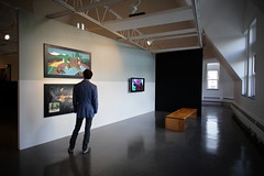
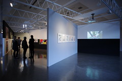
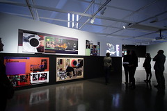
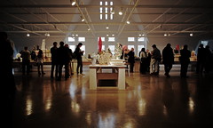
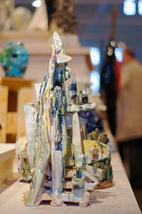
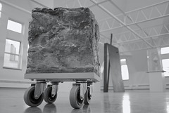
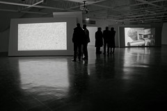
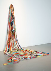
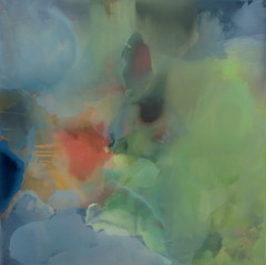
Early in the calendar year, on the ninth day of January, 2011, Gerard Byrne's "A thing is a hole in a thing it is not" opened to the public at The University of Chicago's Renaissance Society.[1]
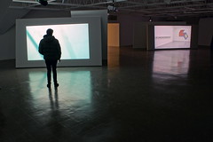 Above: Gerard Byrne's "A thing is a hole in a thing it is not"
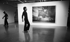
There, the art historical moment which seemed to be addressed by Byrne's exhibition was yet more clearly defined by the first words of Hamza Walker's companion essay: "In the decade spanning 1958 to 1968, developments in American visual art moved at a fast clip. In the wake of a triumphal Abstract Expressionism came Pop Art, Minimalism and Conceptual Art."[2]
Minimalism particularly was the explicit subject of "A thing is a hole in a thing it is not," whether one might argue that Byrne's carefully orchestrated reenactments of new-media history effectively wound together all three post-AbEx threads cited by Walker, above, in a Postmodern metanarrative.
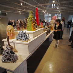
 Above: Gerard Byrne's "A thing is a hole in a thing it is not"
Most relevant to the present undertaking was that one reenactment (described by Walker as being a "vignette" in Byrne's "multi-channel video installation") of "...a 1964 interview with Frank Stella, Donald Judd, and Dan Flavin conducted by Bruce Glaser for WBAI radio, New York."[3]
Following the (1964) interview which interested Byrne and within the decade (1958 to 1968) numbered by Walker: Donald Judd introduced his "stacks" in 1965;[4] Frank Stella introduced his "Protractor" series in 1967.[5]
Outside of Byrne's installation, even here, in a city so strongly associated with provincial attachments to graphic, decorative, and surreal renditions of the human figure, the echoes of Stella and Judd continue to reverberate.[6]
Whether by coincidence or coordination, four months after the close of "A thing is a hole in a thing it is not" the Summer of 2011 has yielded up many works indebted to the Minimalist dialogue.
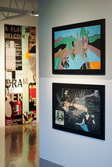
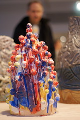
To her credit, Time Out Chicago's Lauren Weinberg appears to have been the first person, in print, to employ the Minimalist reference. In her review of Kendell Carter at moniquemeloche gallery, Weinberg wrote: "'DJ (2010),' a column of copper-plated Timberland boots anchored to a wall, refers to a Donald Judd sculpture."[7]
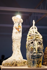
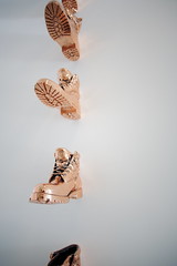 Above: Kendell Carter's "DJ"
The modular component of Judd's early "stack" works had been the galvanized, or plated, metallic box. Carter simply swapped the boot for the box: maintaining the unit in repetition along a vertical axis, fixed to the gallery wall. The Hirshhorn Museum and Sculpture Garden, at the Smithsonian, in Washington, DC, contains one of Judd's untitled "stacks," from 1969, which exhibits a cupric surface closely approximated by Carter in "DJ."[8]
Maybe like our national psyche, or a now middle-aged male born of the same generation, the hard-edged figure, as exercised by Judd and Stella in the '60s, has, for better and for worse, broken, and softened a bit. But the mode--the rhythm of the unit in repetition--is as strong as ever. Mark, mark, marky, mark: Carter works with a conceptual refrain.[9]
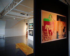
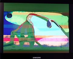
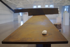
Atop the Art Institute of Chicago's Modern Wing, on the Bluhm Family Terrace, colorful concentric rings are the things repeated. Pae White's "Restless Rainbow,"[10] cut at regular intervals by the Terrace's white picket fence, hearkens back to the semi-circular motif of Frank Stella's "Protractor" series. Not at the Art Institute of Chicago but rather at the Solomon R. Guggenheim Museum in New York, New York, Stella's "Harran II," from 1967, seems good to compare.[11]
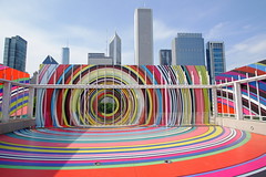 Above: Pae White's "Restless Rainbow"
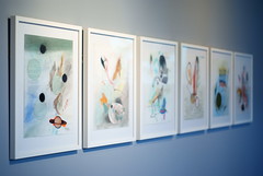
Closer to home, the ninety-degree vertical-to-horizontal transition made by White's supple, polychromatic bands was foreshadowed by Andrea Myers' "Soft Concentrics" in the 2010 exhibition "Ps & Qs," curated by Jeff Ward and Shannon Stratton, at the Hyde Park Art Center.[12]
 Above: Andrea Myers' "Soft Concentrics"
And White's curvilinear application of vinyl tape to a glass surface for the expressed purpose of creating a potentially immersive optical effect was prefigured by Carla Arocha and Stephane Schraenen's 2010 installation "As if," found, again, at moniquemeloche gallery.[13]
 Above: Carla Arocha and Stephane Schraenen's "As if"
Contemporary with the aforementioned works of Donald Judd and Frank Stella, noteworthy for a high-contrast, curvilinear unit in repetition, and productive of an "op" effect, might be a piece such as the 1963 "Fall" by Bridget Riley, from the Tate Collection.[16]
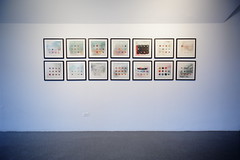
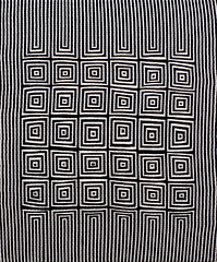
But it isn't only Pae White's "Restless Rainbow" which in the Summer of 2011 recalls both Op Art and also "Ps & Qs" from 2010 at the HPAC. At threewalls gallery, in "Either/Or/Both," curated, again, by Shannon Stratton,[14] Samantha Bittman's painted textiles rely upon the same formal devices as Todd Chilton's thickly painted black and white canvas from the previous year's Hyde Park show.[15]
 Above: One painting from Samantha Bittman's "Zebra" series, at threewalls
 Above: Todd Chilton's "Buzzy Diamonds" from Hyde Park Art Center
Confounding the effort to tell a good story about the development of abstract art (painting) after the period described by Walker in the second paragraph, above, is the persistence of Expressionism.
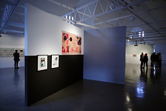
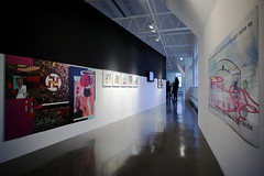
The rhetoric of geometry, and all of the "Classical" devices of the Apollonian camp, just go to Hell when confronted with the aggressive, intuitive, asymmetrical brushwork of André Butzer at Rhona Hoffman.[17]
 Above: André Butzer's "Nicht Furchten!" from Rhona Hoffman Gallery
It is abstract art. It is on display, over the Summer of 2011, in Chicago. And it is possible to describe the piece (above) as employing, in a painterly manner, a palette of vivid near-primary hues.
But Butzer gives little evidence of having any use for the "triumphal" post-war American stories of either Minimalism or AbEx. Rather, Butzer's oeuvre resembles the offspring of a union between what is cruel in George Grosz and what is dark in Paul Klee. The nightmarish "big black blob" at the center of ("Nicht Furchten!" above) the painting's action reminds one of Wesley Kimler's local position; there isn't much light between Butzer and Kimler. Nevertheless, as a painting, on its own terms, "Nicht Furchten!" works.
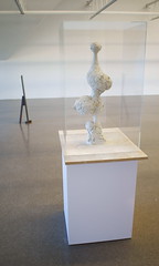
"Painterly" less well describes the more "lyrical" non-objective abstract work by Patrick Berran at Thomas Robertello,[18] and Jasmine Justice at 65GRAND.[19] Berran gives the impression of relying heavily (maybe like Helen Frankenthaler) on a stain painting technique: building successive layers of relatively muted color. Justice, in addition to her visible brushwork and washes, shows (occasional) evidence of masking--among other means, not being committed to any one technique.
 Above: Patrick Berran from Thomas Robertello Gallery
 Above: Jasmine Justice from 65GRAND
Where this leads is anyone's guess. But the formal re-engagement is difficult to miss--if only in contradistinction to the partisanship, social activism, and conceptual bent, which have for so many years impoverished our "visual" culture.
Notes:
[1]
http://www.renaissancesociety.org/site/Exhibitions/Intro.Gerard-Byrne-A-thing-is-a-hole-in-a-thing-it-is-not.618.html
[2]
http://www.renaissancesociety.org/site/Exhibitions/Essay.Gerard-Byrne-A-thing-is-a-hole-in-a-thing-it-is-not.618.html
[3] Ibid.
[4]
http://www.tate.org.uk/servlet/ViewWork?cgroupid=999999961&workid=7770&searchid=9690&roomid=false&tabview=text&texttype=8
Above: "With the exception of the first of these arrangements, a large galvanized iron ‘stack’ comprising seven five-sided boxes, completed in June 1965 (DSS 65), each ‘stack’ is composed of a minimum of ten units."
See also:
http://www.christies.com/LotFinder/lot_details.aspx?intObjectID=5261476
[5]
http://www.moma.org/collection/artist.php?artist_id=5640
Above: "The Protractor series (1967–9, with additional works until 1971) is characterized by monumental scale, potentially garish colour juxtapositions and, for the first time, curvilinear forms derived from the drawing tools referred to in the title."
Note: The text above is attributed to Constance W. Glenn, Grove Art Online, 2009, Oxford University Press, and employed on-line by The Museum of Modern Art, 11 West 53 Street, New York, NY, at URL listed.
[6] Chicago's connection to the Bauhaus school has been proven much stronger in architecture than in visual art.
See also:
http://art.newcity.com/2011/07/25/review-go-figuresmart-museum-of-art/
Above: Jason Foumberg's July 25, 2011, review of "Go Figure" at the Smart Museum of Art.
[7]
http://timeoutchicago.com/arts-culture/art-design/14805147/kendell-carter-weaves-references-to-hip-hop-into-abstract-works
[8]
http://hirshhorn.si.edu/visit/collection_object.asp?key=32&subkey=8625
[9]
http://moniquemeloche.com
Above: "Liberation Summer," featuring Kendell Carter, May 21–July 30, 2011, moniquemeloche gallery, 2154 W. Division, Chicago, IL
Mark, mark, marky, mark:
Compare, also, Carter's offset text ("mark mark," above) to Kay Rosen's "Go Do Good," below:
http://www.chicagogallerynews.com/blog/post/2011/05/24/Go-Do-Good-Chicago!-Kay-Rosene28099s-New-Installation-Unveiled.aspx
[10]
http://www.artic.edu/aic/exhibitions/exhibition/paewhite
Above: Pae White, "Restless Rainbow," May 21–September 20, 2011, Bluhm Family Terrace, Art Institute of Chicago
See also, below, it is at best an exaggeration to claim that the city skyline has been wholly obscured by the installation:
[11]
http://www.guggenheim.org/new-york/collections/collection-online/show-full/piece/?search=Frank%20Stella&page=1&f=People&cr=1
[12]
http://www.hydeparkart.org/exhibitions/2010/02/ps_qs_1.php
Above: "Ps & Qs," featuring Todd Chilton, Pete Fagundo, Carrie Gundersdorf, Katy Heinlein, Jessica Labatte, Andrea Myers and Tessa Windt; curated by Jeff Ward and Shannon Stratton; February 28-June 6, 2010; Hyde Park Art Center, 5020 South Cornell Avenue, Chicago, Il
[13]
http://paulgermanos.blogspot.com/2010/09/review-carla-arocha-stephane-schraenen.html
Above: "As if," featuring Carla Arocha & Stephane Schraenen; September 16–November 6, 2010; moniquemeloche gallery, 2154 W. Division, Chicago, IL
[14]
http://www.three-walls.org
Above: "Either/Or/Both," featuring Samantha Bittman, Stephanie Brooks, Casey Droege, Michael Milano, Hans Peter Sundquist; curated by Shannon R. Stratton; July 1-30th, 2011, threewalls, 119 N Peoria St # 2D, Chicago, IL
[15] Todd Chilton, September 4-October 2, 2010, Slow Gallery, 2153 W. 21st St, Chicago, IL:

Samantha Bittman, July 1-30th, 2011, threewalls, 119 N Peoria St # 2D, Chicago, IL:
Note: Exhibited in 2011, the bulk of Bittman's work (at threewalls) is contemporary with Chilton's work, i.e., it dates from 2009-2010.
[16]
http://www.tate.org.uk/servlet/ViewWork?cgroupid=999999961&workid=12600&searchid=9648
Above: "Fall," a painting from 1963, by Bridget Riley, in the Tate Collection
[17]
http://www.rhoffmangallery.com
Above: "Never Let Me Go," featuring André Butzer, Folkert de Jong, Lari Pittman, Rona Pondick, Jeni Spota, Nicola Tyson, and John Wesley; curated by Terry R. Myers; May 20-July 29, 2011, Rhona Hoffman Gallery, 118 N Peoria St # 1A, Chicago, IL
[18]
http://www.thomasrobertello.com
Above: "One Must Eat the Other," featuring Patrick Berran, May 27-August 14, 2011, Thomas Robertello Gallery, 27 N Morgan St, Chicago, IL
[19]
http://www.65grand.com
Above: "You'll Love Them All for Giving You the Swellest Time You've Ever Had!" featuring Jasmine Justice, May 20-June 25, 2011, 65GRAND, 1369 W Grand Ave, Chicago, IL
Related Posts:
http://paulgermanos.blogspot.com/2012/02/editorial-todd-chilton-vis-vis-scott.html "Editorial: Todd Chilton vis-a-vis Scott Stack," February 23, 2012
- Paul Germanos