Given the benefit of hindsight, it's now possible to argue that Warren's whole spatial exercise was evidence of her superiority to the clay sculptor, namely William J. O'Brien, who succeeded her in the aforementioned space. More ironically, given her personal investment in the primal modelling of a plastic material, Warren can now be seen as having psychologically prepared the Chicago audience for O'Brien.
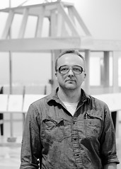
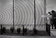
Above: William J. O'Brien @ The Renaissance Society
And it's a great mystery why no one has thought to reappraise Warren, even as O'Brien is now praised.[2]
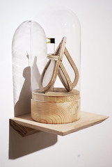
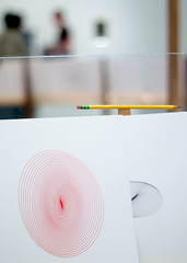
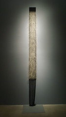
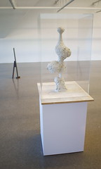
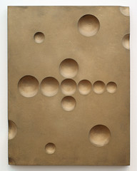
Warren, like a sculptor, concerned herself with the formal qualities of shape, line, scale, texture, and mass; her choice and handling of material varied from piece-to-piece. Notably, Warren's objects were not in any case so heavily pigmented that an essential substance was obscured; nor did she ever employ a vivid hue. Color, simply, was not a strong visual element in Warren's compositions; color was weak, though not conspicuous in its weakness.
Too, conceptually, it's good to remember that Rebecca Warren's action against historical sculptural modes and forms necessitated at least some understanding thereof.[3]
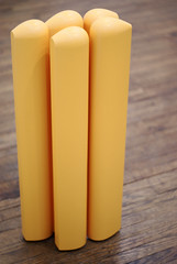
Above: William J. O'Brien @ The Renaissance Society
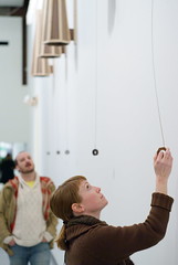
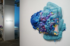
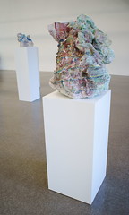
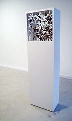
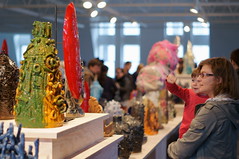
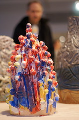
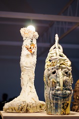
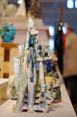
William J. O'Brien's work at the Renaissance Society is altogether different: color is often strong; gloss is often thick; and not much else is exciting--in a formal sense. Whatever the pieces might mean in relation to the history of painting or ceramics, when one considers O'Brien's production as "sculpture," it's difficult to be satisfied. What is it--other than surface treatment and firing--which accounts for the variance between the receptions of Warren and O'Brien? Is O'Brien's work (at the Renaissance Society) something other than statuary, i.e., free-standing, three-dimensional, art which a viewer encounters in the round?
Was Warren an "easy target" for local critics by virtue of her foreign residence? Had she attended SAIC rather than Goldsmiths would Warren have received the same treatment? It does seem good to acknowledge that while his (O'Brien's) work looks like Art Brut, in Chicago O'Brien is anything but an outsider.[4] In fact, that which the local "art community" is able to give--it has given to O'Brien very quickly.[5] One is made to wonder: Why?
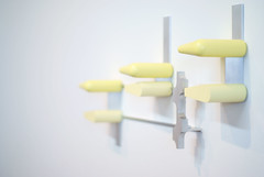
Above: William J. O'Brien @ The Renaissance Society
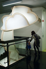
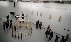
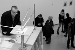
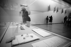
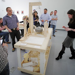
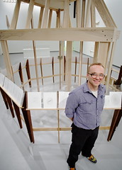
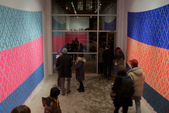
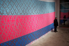
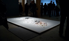
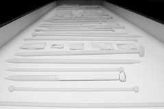
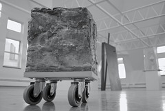
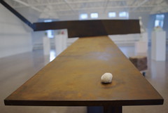
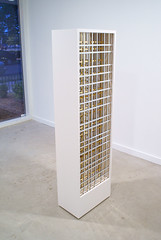
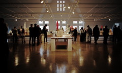
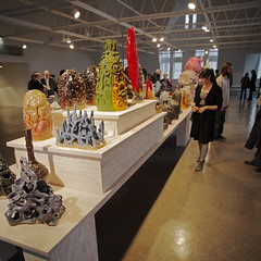
It seems to be the case that (roughly) eighteen months ago, at Marianne Boesky Gallery in New York, William J. O'Brien presented modestly-scaled, polychromatic, ceramic pieces upon an elegant, rectangular tabletop.[6] And the current display at the Renaissance Society differs chiefly (only) in that it involves the gathering of an even larger number of clay lumps, all of which have been shifted to a custom-fabricated, heavy-plywood, T-form, multi-tiered plinth.[7]
Above: William J. O'Brien @ The Renaissance Society
A spectator in Chicago (or New York) might be hard-pressed to identify any one work sitting on that plywood as a "virtuoso piece." O'Brien's output is strikingly regular, and crude; it evidences no "higher" academic or technical training. Is it precisely that "democratic" manifestation, that "community of objects," which is found to be praiseworthy? Would a people hostile to the idea of distinction, even in appearance, want, or need, art like O'Brien's art?
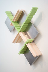
Above: William J. O'Brien @ The Renaissance Society
There does seem at this moment to be a "rising tide" of young Chicago artists engaged in the business of cobbling found objects, and molding common materials, in a manner which belies the "advanced" degrees (usually) held by the makers. The phenomenon seems not disconnected from Arte Povera in form or (invoked) theory; Art Brut has already been mentioned. In the looming shadow of fine art PhD programs, one is made to wonder quite seriously about the content of existing MFA programs: how are they necessary, or even helpful, for this sort of movement?
Above: William J. O'Brien @ The Renaissance Society
Whether it's found within the artwork, or in some speech or text which exists apart from the artwork, ought not an expression *from the artist* to have the effect of suggesting a refinement, i.e., a subtlety and complexity of thought or insight, which has been cultivated within his or her person? When such evidence is thin, or lacking altogether, one is made to wonder not only about particular exhibitions, or personalities, but about the systems which produce and support them.
The Neo-Povera and Faux Brut get the laurels here and now; it's a time of New Brutes.
+ + +
William J. O'Brien
May 15 – June 26, 2011
Tuesday - Friday: 10:00 am - 5:00 pm
Saturday, Sunday: 12:00 am - 5:00 pm
Closed Mondays
The Renaissance Society
Bergman Gallery, Cobb Hall 418
5811 S. Ellis Avenue
Chicago, Illinois
Exhibitions at The Renaissance Society are free of charge.
http://www.renaissancesociety.org
+ + +
[1] http://art.newcity.com/2010/10/11/review-rebecca-warrenthe-renaissance-society/
Above: "Review: Rebecca Warren/The Renaissance Society," by Jason Foumberg, October 11, 2010
See also: http://blog.art21.org/2010/12/31/center-field-art-in-the-middle-with-bad-at-sports-top-10-chicago-art-events-in-2010/
Above: Claudine Ise and Meg Onli name Foumberg's review above as "Best of 2010" on Decmber 31, 2010:
"Best critical review of an internationally acclaimed artist: Jason Foumberg’s review of Rebecca Warren’s exhibition at The Renaissance Society..."
[2] http://art.newcity.com/2011/05/30/review-william-j-o%E2%80%99brienrenaissance-society/
Above: "Review: William J. O’Brien/Renaissance Society," by Jason Foumberg, May 30, 2011
[3] http://paulgermanos.blogspot.com/2010/11/review-rebecca-warren-renaissance.html
[4] O'Brien's position within Chicago's "art world," as defined by his on-line bio, is characterized by multiple, overlapping points of contact with prominent figures and institutions.
For example:
O'brien's bio lists a solo exhibition in 2010 at Shane Campbell Gallery, Oak Park, IL.[a] Shane Campbell Gallery, Oak Park, IL, provides the same address (125 N. Harvey Avenue Oak Park, Illinois 60302) as Artforum critic Michelle Grabner's "domestic" gallery space (The Suburban) and home.[b] O'brien's bio lists a 2008 review written by Michelle Grabner.[c] O'brien and Michelle Grabner are two of the twenty artists currently listed on the Shane Campbell Gallery roster.[d] Both William J. O'Brien and Michelle Grabner are School of the Art Institute employees.[e]
Again:
O'brien's bio lists his participation in the group exhibition "New Icon," at Loyola University Museum of Art, Chicago, IL, in 2010.[f] The group show "New Icon," at Loyola University Museum of Art, was curated by Britton Bertran.[g] Britton Bertran served as Individual Artists Awards Coordinator for The Richard H. Driehaus Foundation.[h] The Richard H. Driehaus Foundation is a partner organization of Artadia.[i] O'brien's bio lists the 2007 receipt (Artadia lists 2006) of an Artadia grant.[j] The Richard H. Driehaus Foundation lists its 2008 funding of both Artadia and Britton Bertran.[k] Both William J. O'Brien and Britton Bertran are School of the Art Institute employees.[l]
[a] http://www.shanecampbellgallery.com/artists/obrien/bio/
[b] http://www.thesuburban.org/
[c] http://www.shanecampbellgallery.com/artists/obrien/bio/
[d] http://www.shanecampbellgallery.com/artists/
[e] http://www.saic.edu/people/O%27Brien_William_John.html?color=ORANGE
[e] http://www.saic.edu/people/Grabner_Michele.html?color=ORANGE?color=ORANGE
[f] http://www.shanecampbellgallery.com/artists/obrien/bio/
[g] http://www.luc.edu/luma/news/051710_new_icon.html
[h] http://www.linkedin.com/pub/britton-bertran/4/751/31
[i] http://www.artadia.org/newspages/newsletter/2007NLWinter.html
[i] http://www.artadia.org/newspages/newsletter/2010NLWinter.html
[j] http://artistregistry.artadia.org/registry/view_artist.php?aid=146
[k] http://www.driehausfoundation.org/node?page=3
[l] http://www.saic.edu/people/Bertran_Britton.html?color=ORANGE
[5] http://articles.chicagotribune.com/2010-08-01/entertainment/ct-ae-0801-mca-michael-darling-20100801_1_curator-museum-director-seattle-art-museum/3
Above: Chicago Tribune reporter Lauren Viera's interview of MCA Chief Curator Michael Darling, August 01, 2010:
Darling: "...maybe people are looking for a museum to give the stamp of approval on them before they're launched onto the next level. That kind of advocacy for artists is something that I'm really excited about."
Viera: "Do you have anyone in particular in mind?"
Darling: "William J. O'Brien, for instance, is an artist that's kind of come up through Chicago, came through the 12x12 program, is starting to really get some international attention."
[6] http://artnews.org/gallery.php?i=162&exi=17886&Marianne_Boesky&William_J_O_Brien
Above: Image of tabletop installation in New York.
[7] Per Hamza Walker: Walker himself sketched the T-type installation which was then elaborated upon and executed according to the vision of architect John Vinci. O'Brien did not design or build the pedestal.
- Paul Germanos