Anish Kapoor's "Cloud Gate" is well-loved in Chicago. Its polished, stainless steel skin reflects not only the City skyline but also those spectators near to the curvilinear work, thus providing equal opportunity for civic pride and public vanity--assuming that they are distinguishable.[1]
 Above: Anish Kapoor's "Cloud Gate"
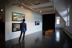
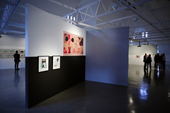
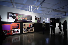
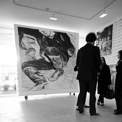
In a similar manner, for the purpose of examining their own reflections, patrons (including the author) drew close to the mirror-like surfaces contained within four pieces of statuary on display at the opening of Carla Arocha and Stephane Schraenen's show "As if" at Monique Meloche Gallery.
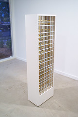 Above: Carla Arocha and Stephane Schraenen's "Untitled (gold)" which, on a different scale, would fit quite nicely into Chicago's skyline. See MvdR's 1971 IBM Building,[2] which Ira J. Bach called, "superbly proportioned."[3]
It was a human response, likely engendered by the scale and proportion (59 x 20 x 12 inches in every case) of the art.[4] The bright, acrylic sheets filling each sculpture were said to have been laser-cut; the monolithic cabinets holding that acrylic were said to have been fastidiously constructed from synthetic board painted with automobile enamel. But, contrary to the orchestrated precision which characterized the process of the artworks' fabrication, it was that random, casual, and natural reaction of the audience which provided the color--according to the (reflected) dress of the attendee. What seemed at first proper to judge as a minimal and nearly monochromatic presentation of regular, geometric forms was enlivened by the entry of the crowd.
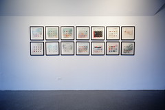
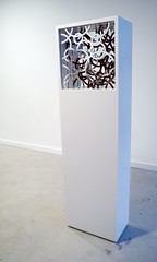
 Above: Carla Arocha and Stephane Schraenen's "Untitled (lines)"
Visual art is "alive" when it's seen, in real time and space, by an engaged party. And, generally, it's fatal to understanding to imagine that artworks (any cultural products) exist only in the vacuum of "white cube" gallery and museum spaces. Hopefully, internet viewership and academic practice--being abstracted from reality--will not wholly displace the pursuit of direct experience and the practice of personal contemplation. How much color is in Arocha and Schraenen's show? as much or as little color as is in the environment in which it's displayed. Light, clothing, paint on the walls: The pieces are affected by whatever surrounds them.
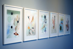
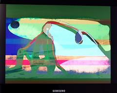
 Above: Carla Arocha and Stephane Schraenen's"Untitled (bubbles)"
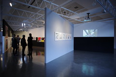
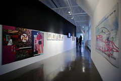
On perception: The gallery's front window and front wall (facing Division) have been treated with precisely-cut vinyl tape, so that two concentric ring patterns are held on planes parallel to one another, separated by a distance of roughly two meters. As viewed from the sidewalk and/or street, a "moire" effect appears in a striking manner. The high contrast of the black and white, figure and ground, is boldly graphic. But the piece is truly three-dimensional (sculpture) as its appreciation depends upon spatial relationships. It's from this installation that the show takes its title; and it's probably the most effective use of the storefront to date.
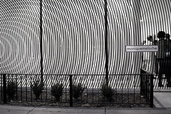 Above: Carla Arocha and Stephane Schraenen's "As if"
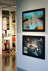
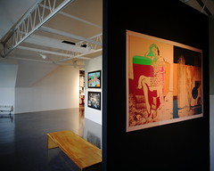
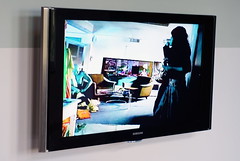
The whole show--installation, statuary, and four photographic prints--seems very much more expansive than it is, thanks to good placement and light.
[1] Anish Kapoor's "Cloud Gate" is curvilinear in shape--but contains within its surface the reflections of many rectilinear shapes as a result of the context in which it has been placed.
[2]
http://en.wikipedia.org/wiki/330_North_Wabash
Above: Mies van der Rohe's 1971 IBM Building at 330 N. Wabash
[3] "Chicago's Famous Buildings" Third Edition, ed. Ira J. Bach (1965, 1969; Chicago: University of Chicago Press, 1980) 95-96.
[4] If the scale and the proportion (but not the shape) of Arocha & Schraenen's statuary relates to the human body, in the context of Chicago the shape and proportion (if not the scale) of that statuary relates to the City's Modern architecture.
Carla Arocha & Stephane Schraenen
"As if"
September 16 – November 6, 2010
Tuesday – Saturday, 11:00 am - 6:00 pm
Closed Sunday and Monday
Monique Meloche Gallery
2154 W. Division (@ Leavitt)
Chicago, IL 60622
http://moniquemeloche.com
See also: Lauren Weinberg's Time Out Chicago review of Carla Arocha & Stephane Schraenen,
http://chicago.timeout.com/articles/art-design/90016/carla-arocha-and-stephane-schraenen-at-monique-meloche-art-story
- Paul Germanos