Sunday, September 19, 2010

Review: Carla Arocha & Stephane Schraenen @ Monique Meloche

Anish Kapoor's "Cloud Gate" is well-loved in Chicago.  Its polished, stainless steel skin reflects not only the City skyline but also those spectators near to the curvilinear work, thus providing equal opportunity for civic pride and public vanity--assuming that they are distinguishable.[1]

Anish Kapoor: Cloud Gate
Above: Anish Kapoor's "Cloud Gate"

In a similar manner, for the purpose of examining their own reflections, patrons (including the author) drew close to the mirror-like surfaces contained within four pieces of statuary on display at the opening of Carla Arocha and Stephane Schraenen's show "As if" at Monique Meloche Gallery.
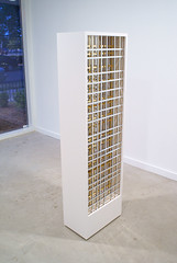
Carla Arocha & Stephane Schraenen @ Monique Meloche
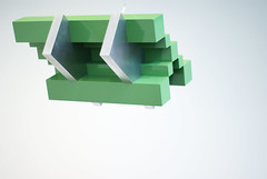
Above: Carla Arocha and Stephane Schraenen's "Untitled (gold)" which, on a different scale, would fit quite nicely into Chicago's skyline.  See MvdR's 1971 IBM Building,[2] which Ira J. Bach called, "superbly proportioned."[3]

It was a human response, likely engendered by the scale and proportion (59 x 20 x 12 inches in every case) of the art.[4]  The bright, acrylic sheets filling each sculpture were said to have been laser-cut; the monolithic cabinets holding that acrylic were said to have been fastidiously constructed from synthetic board painted with automobile enamel.  But, contrary to the orchestrated precision which characterized the process of the artworks' fabrication, it was that random, casual, and natural reaction of the audience which provided the color--according to the (reflected) dress of the attendee.  What seemed at first proper to judge as a minimal and nearly monochromatic presentation of regular, geometric forms was enlivened by the entry of the crowd.

Carla Arocha & Stephane Schraenen @ Monique Meloche
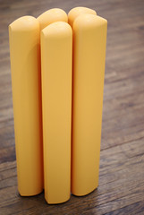
Above: Carla Arocha and Stephane Schraenen's "Untitled (lines)"

Visual art is "alive" when it's seen, in real time and space, by an engaged party.  And, generally, it's fatal to understanding to imagine that artworks (any cultural products) exist only in the vacuum of "white cube" gallery and museum spaces.  Hopefully, internet viewership and academic practice--being abstracted from reality--will not wholly displace the pursuit of direct experience and the practice of personal contemplation.  How much color is in Arocha and Schraenen's show? as much or as little color as is in the environment in which it's displayed.  Light, clothing, paint on the walls: The pieces are affected by whatever surrounds them.
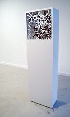
Carla Arocha & Stephane Schraenen @ Monique Meloche
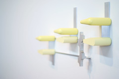
Above: Carla Arocha and Stephane Schraenen's"Untitled (bubbles)"

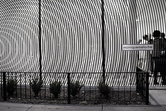
On perception: The gallery's front window and front wall (facing Division) have been treated with precisely-cut vinyl tape, so that two concentric ring patterns are held on planes parallel to one another, separated by a distance of roughly two meters.  As viewed from the sidewalk and/or street, a "moire" effect appears in a striking manner.  The high contrast of the black and white, figure and ground, is boldly graphic.  But the piece is truly three-dimensional (sculpture) as its appreciation depends upon spatial relationships.  It's from this installation that the show takes its title; and it's probably the most effective use of the storefront to date.
Carla Arocha & Stephane Schraenen @ Monique Meloche
Above: Carla Arocha and Stephane Schraenen's "As if"

The whole show--installation, statuary, and four photographic prints--seems very much more expansive than it is, thanks to good placement and light.

[1] Anish Kapoor's "Cloud Gate" is curvilinear in shape--but contains within its surface the reflections of many rectilinear shapes as a result of the context in which it has been placed.

[2] http://en.wikipedia.org/wiki/330_North_Wabash
Above: Mies van der Rohe's 1971 IBM Building at 330 N. Wabash

[3] "Chicago's Famous Buildings" Third Edition, ed. Ira J. Bach (1965, 1969; Chicago: University of Chicago Press, 1980) 95-96.

[4] If the scale and the proportion (but not the shape) of Arocha & Schraenen's statuary relates to the human body, in the context of Chicago the shape and proportion (if not the scale) of that statuary relates to the City's Modern architecture.

Carla Arocha & Stephane Schraenen
"As if"
September 16 – November 6, 2010
Tuesday – Saturday, 11:00 am - 6:00 pm
Closed Sunday and Monday
Monique Meloche Gallery
2154 W. Division (@ Leavitt)
Chicago, IL 60622
http://moniquemeloche.com

See also: Lauren Weinberg's Time Out Chicago review of Carla Arocha & Stephane Schraenen,
http://chicago.timeout.com/articles/art-design/90016/carla-arocha-and-stephane-schraenen-at-monique-meloche-art-story

- Paul Germanos

Thursday, September 9, 2010

Review: Todd Chilton @ Slow

The best of Todd Chilton's paintings produce a visual stimulation of such intensity that prolonged exposure is uncomfortable.  Too, one is led to believe that the sometimes protracted effort which is required to successfully execute such works is not entirely comfortable for his own person.

Todd Chilton @ Slow
Above: "Wiggle" @ Slow

Here, the paint is often thick upon the canvas. And, it's Chilton alone who's physically involved in the process of creating the things.  He freely admits to failure in his successive attempts to build a proper composition; what didn't work, for him, is (mostly) lost as underpainting or altogether discarded.  When so much contemporary craft is noncommittal, there's a pleasure to be taken in the arrival at a definite position after a personal struggle.

Todd Chilton in Ps & Qs @ Hyde Park Art Center
Above: "Buzzy Diamonds" in Ps & Qs @ HPAC, March 2010

"Contradiction" seems a good word to employ (and it's not to be construed as pejorative) when attempting to describe Chilton and his work.  He parallels many of the linear patterns of Op; but if Bridget Louise Riley is recalled from the 80's and 90's, Chilton's contemporary channeling is much more painterly than was the historical reality.  And while he's clearly interested in geometric abstraction he doesn't fuss with hard edges; there he's like Sean Scully.  When the admixture gels, his canvases are thick, vibrant masses of highly contrasting hue and/or value which possess a kaleidoscopic energy.  He pulls it off--in Chicago.

Todd Chilton @ Tony Wight
Above: "Pointing to the Middle" @ Tony Wight, January 2009

With regard to this current show, "Wiggle" in particular manages to pack a nice punch in spite of the fact that it, like all of the paintings on display at Slow Gallery, is of a rather modest (350 square inches) scale.  Alongside Todd Chilton, Mike Peter Smith exhibits a series of small, well-crafted and surreal sculptures at Slow.  The relationship between the painting and sculpture isn't immediately clear.

Mike Peter Smith @ Slow
Above: "Raft" by Mike Peter Smith @ Slow

Todd Chilton & Mike Peter Smith
"plain plane"
September 4 - October 2, 2010
12pm - 5pm
Slow Gallery
2153 W. 21st Street
773-645-8803
http://www.facebook.com/pages/Chicago-IL/Slow/157109257009

Todd Chilton,
http://www.toddchilton.com

Neoteric Art's 2009 interview with Todd Chilton,
http://neotericart.com/2009/06/21/interview-with-todd-chilton

Dan Gunn's 2009 review of Todd Chilton,
http://art.newcity.com/2009/01/19/review-scott-fife-and-todd-chiltontony-wight-gallery

Todd Chilton has been called (I think inappropriately) a "Neo-Geo" painter. See Grace Glueck's 1987 report on Neo-Geo,
http://www.nytimes.com/1987/07/06/arts/what-do-you-call-art-s-newest-trend-neo-geo-maybe.html

+ + +

Related Posts:

http://paulgermanos.blogspot.com/2011/07/editorial-after-minimalism-in-chicago.html
"Editorial: After Minimalism in Chicago the Summer of 2011," July 22, 2011

http://paulgermanos.blogspot.com/2012/02/editorial-todd-chilton-vis-vis-scott.html
"Editorial: Todd Chilton vis-a-vis Scott Stack," February 23, 2012

- Paul Germanos

Monday, September 6, 2010

Review: Autumn Ramsey @ Julius Caesar

In its current incarnation, Julius Caesar Gallery occupies a singular, cubic room which measures (roughly) 120 square feet per side.  The walls are clean and white.  The light is good.  And Autumn Ramsey's paintings fit well in the small, neutral space.

Though she's expressed a desire to work on a larger scale, each of the five canvases actually in the show covers an area of approximately 500 square inches.  That said, in her strongest pieces an aspect of monumentality is already evident: psychologically.  The sphinx is a weighty placeholder of questions regarding sexuality and death within the memory of the West.  So that if her rendering and color are (see Matisse, 1905) Fauvist, her choice of subject, here, recalls Symbolism.

Autumn Ramsey @ Julius Caesar

Gender enters the program through its obvious (female) depiction in four of the five paintings; the artist imputes a feminine gender to the (fist) fifth painting.  Featured in some figures is a fleshy collapse reminiscent of Guston or (Ramsey is from SAIC) Lutes; but, contra the precedent, Ramsey's own persistent reference (here) is mammillary.  Is Ramsey a Feminist painter?  It's unclear.

Autumn Ramsey @ Julius Caesar

Ambiguity works in the favor of those subjects freed from any discernible (background) context and offered--as though floating--at the center of the canvas.  Not Surreal, but dreamlike, such a presentation reinforces the interpretation of the originally visual experience as a psychic encounter within the realm of the subconscious.

Where the painting succeeds--as painting--it does so by virtue of the power of color and richness of historical ground.  Looking forward, it would be good to see more heavily worked surfaces accompanied by a refinement of technique.

Autumn Ramsey
September 5 - 26, 2010
Saturday and Sunday, 1pm - 4pm
(and by appointment )
Julius Caesar Gallery
3311 W. Carroll
Chicago, IL
http://juliuscaesarchicago.com

Autumn Ramsey,
http://autumnramsey.com

Dan Gunn's 2008 review of Autumn Ramsey,
http://art.newcity.com/2008/09/16/review-autumn-ramsey

- Paul Germanos

Friday, September 3, 2010

Review: Richard Rezac @ Devening Projects

His artworks are well-crafted, appealing, and maddeningly polite.  Chicago-based Richard Rezac carefully organizes solid shapes within very compact dimensions, and through that activity has come to be defined as a sculptor.  But, looking carefully, he's distinguished by the selective application of color, so that it seems equally good to consider him in the company of painters.  Maybe it's that modest balance (ambiguity?) with regard to the fundamental criteria of visual art which quintessentially describes Rezac's work.

Richard Rezac @ Devening Projects

Having written that, the experience which Rezac offers is wholly, and unapologetically, visual.  The rhythm of shapes repeated--the cascade--within any given piece is the result of the artist's own resolution of formal concerns.  External references, which might be drawn in by an observer after the fact, seem to count for little when compared to Rezac's own control of his work's execution.  He's possessed of a peculiar teleology of which his painted sculptures are evidence: they're his products in the sense that an oak produces acorns.

Richard Rezac @ Devening Projects

Historically, it's possible to locate Rezac after Minimalism and to describe him, partly, as a corrective to it.  Minimalist sculptor Richard Serra, for example, might be most (in)famous for the physical encounters which he has forced through the public placement of heavy steel plates.  Such massive objects, industrially fabricated and superficially neglected, seem as antithetical to Rezac's vision as the notion that art has a right to demand interaction through the exercise of its own brute strength.  May 19, 1995, Chicago Tribune critic Alan Artner quoted Rezac as having said: "I am interested in making sculpture that you would approach and understand as you would the things that wash up on shore..."

Richard Rezac @ Devening Projects

Beyond his consideration of the spectator's choice to become involved, Rezac seems to have remembered the choice of direct involvement--in process--made by the AbEx predecessors to Minimalism, such as David Smith.  Given Smith's current status within certain critical circles the comparison might initially seem odd, as it's very hard to apply the oft used (pejorative sense regarding Smith) term "macho" to the man (Rezac) or his art.  But not all studio-based practices lead inevitably towards the same end; nor do all studio-based practices proceed towards their different ends in a like manner.  His (Rezac's) oeuvre is, as written above (and remembering too the reference to teleology) virtuous in an Aristotelian sense: being a mean between one thing and another.  And that state of being characteristic of the work seems not unrelated to the man himself.  Social change, here, isn't proposed through literal activism and engagement, but rather by means of the (manifold sense) modeling--careful, patient, creative--resulting in the art.

Richard Rezac @ Devening Projects

Recalling Alan Artner again: On May 23, 2003, he (Artner) named Rezac, "one of the most [...] brilliant sculptors ever to have worked in Chicago."  Currently on display at Devening Projects is a selection of Rezac's work which spans the decade just past.  It might be a chance to meet Rezac for the first time and evaluate Artner's claim; or it might be a chance to remake his acquaintance in the company of painter Gary Stephan.  The exhibition of Richard Rezac and Gary Stephan, which opened on August 29, 2010, is the first in a year-long series devoted to the bringing together of partners in visual dialogue.

Richard Rezac @ Devening Projects

On September 25, 2010, a second installation, featuring new work by the same two artists--including a gallery talk which is free, and open to the public--will begin.

Richard Rezac & Gary Stephan
August 29 – October 16, 2010
Saturdays 12pm – 6pm
(and by appointment)
Devening Projects and Editions
3039 W. Carroll
Chicago, IL 60612
http://deveningprojects.com

Richard Rezac,
http://richardrezac.com

Gary Stephan,
http://garystephanstudio.com

- Paul Germanos